#454- Jack's Back...
Hi everyone-
I decided to step away from the Vegas images today after working on some new processing of older images in Photoshop over the last few days.
Today's images are of Jack. They were shot in Savannah Georgia on a hotel balcony. The original image was posted some time ago but after revisiting them in photoshop I thought we'd take another look at it.
Some background on how the image was shot... It was a bright sunny day in Savannah and we were on a balcony that was in full shade but it was open. so basically the building was to the viewers left and the sun was overhead of that. The viewers right side was the open balcony. So while it was bright and sunny we were in an open shade. Here is a SOOC shot to show the ambient light in the area where we were shooting: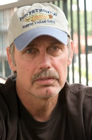
Jack was sitting on a chair on the balcony. To the viewers left was a hotel room window and the curtains were closed in it.
The image was shot hand held using a Nikon D300 at ISO 200, 1/250 sec at f/22. The lens was a Nikon 80-400vr at 160mm. The flash unit was an Alien Bees head with a silver reflector on it. I can't completely remember the set up but it was a few feet away at a bit of a reduced power. I'm sorry I don't remember exactly what it was.
So that's the set up. Here is the SOOC image: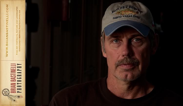
As you can see that is somewhat flat and not to exciting. So Since I have been at home pretty much under the weather I decided to see what I could do with the image. I'll give you a brief explanation of what went on here but it's pretty basic because I am really bad at writing down everything that I did. I promise I'll get better with that and come up with a good way to pass that info along.
So that being said, I first off made some global adjustments and set the white and black points.
Then I smoothed the skin a bit with a surface blur.
Then I created masks for the highlights and shadows. Here I did a ton of work.
Then a few more curves adjustments.
After that it was all pretty much experimental. Blending modes, saturation, masks, this is where I am bad at keeping track.
Here is the final image in a color version: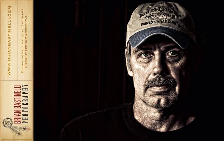
Of course I wanted to see what it looked like in black and white: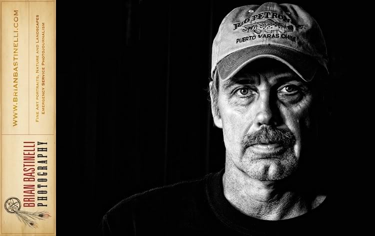
And then in a selenium toned version: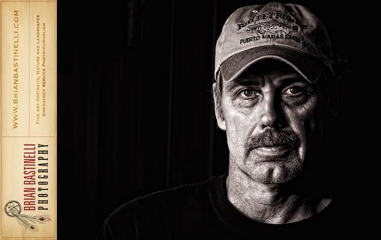
I am not sure which I like the best. But I think they all work pretty good in bringing out the character of Jack's face.
I'd love to hear what you think. Which is your favorite? And does anyone have any questions, or thoughts on how to improve anything? It's all a learn as you go process so I'd love to hear your comments.
Have a great day!

5 comments:
I think my favorite is the last one you posted. The non-color version seems to make the character of his face show through better. The tinting on the final version seems to set the right mood for his expression.
Nice job with the post processing. You pushed it in the right direction.
I think I prefer the pure black and white version best, but all are great. Nice work! I'm wondering what your thoughts are - spending time and lots of layers vs. using Lucis Art or Topaz in order to get that high def / Dave Hill look?
Hey guys,
Thanks for your feedback. I do appreciate it.
Steve, That's a great question. The easy answer is of course, it depends on each person and how their workflow is set up.
Now for me personally, hers how I have gotten to they way I do it.
Initially I had Lucis Art and used it pretty heavily. Although more recently some things have changed.
First, was I started to develop a less is more feeling when it comes to this style. I'll be the first to admit that I did use it heavily for a while.
But there are some effects of the process that I don't like to much. Such as the strange darkening of large areas of color and some of the haloing.
So I started to apply the effect in layers anyway. So that I could add it and remove it where I wanted to.
I would create several layers and apply Lucis in layers and different intensities to the areas that I wanted it.
Then, I made the switch to MAC. And at the same time Lucis was in the process of re introducing their new version of the software.
Being a cheapskate I haven't purchased the new version of the software yet.
So I needed to come up with a different way to achieve the look. At the same time I wanted to do it better than I was before.
That is how I started to do this process in layers even more than I had before.
Also by doing it this way I seem to have a lot more control over details. It is not as global as the plugins, if that makes sense.
So...long story short, I am learning to like the layers'more/time process over the plug in process.
That being said I would have to think there might be a good middle ground there somewhere.
I also think I might be able to automate some of the process that I am developing to create the images.
Hopefully that was a helpful answer. It's definitely a work in progress/ learn as you go kind of thing.
Let me know if you have any more questions, and thanks for asking!!
Have a great day!
Brian
Nice work Brian!
I think I like the B&W best but it is a very close call!
Well done!
Barry
I like the last one the most.
Post a Comment