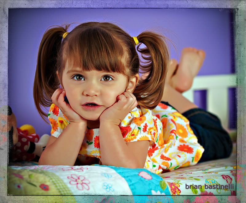
#391-Let's Play Photo Shoot...

Hi everyone-
I hope you all had a great weekend. Ours was nice. We didn't have a whole lot to do for a change. On Saturday we spent some time with friends for lunch and on Sunday we did the same but for dinner. The rest of the weekend was spent pretty much relaxing.
That was nice after the last two months of holiday rush. We did squeak out some time Saturday night to play around with the new lights a bit.
Today's image was shot with a two light set up. One to camera right was a soft box and was the key light. The second was to camera left and was a fill a little over a stop less than the key. It was a very quick set up because the subject while happy had some ants in her pants and was also getting a little grumpy. So I didn't have a lot of time to tweak the set up.
From just looking at the image I think the light was a little strong here. I corrected that some what in post however going much further seemed to start to degrade the image a bit.
As always I would love to hear your comments.
Have a great day!
1/12/2009 01:31:00 AM
|
|
This entry was posted on 1/12/2009 01:31:00 AM
You can follow any responses to this entry through
the RSS 2.0 feed.
You can leave a response,
or trackback from your own site.
7 comments:
Great shot Brian!
Your set-up worked great as far as I can tell. Really nice catch lights in her eyes, great pose, composition, and colors.
Well done!
Barry
Hi Brian,
Great photo of Cree. I love her expression and the way you have her posed. I do agree with you that the light could be brought down just a bit, and maybe the fill light to main ratio just a bit down too.
But, the expression and pose trump here. Great shot!!
Well done. Love the angle, expression, and the compression form the lens.
Great child portrait. Perfect pose and surroundings. Nobody would guess that you just recently starting shooting with strobes... Seriously.
For a child portrait I actually like the tighter key/fill ratio. Drama works better on old people who have been shaped by life already. Children are still innocent of drama.
That said, what I might try is to feather your key light towards the ceiling so that the bead spread is slightly less lit, and most of the light falls on the face - that would keep the visual focus. You can do it in post as well with a graduated brightness filter in Lightroom.
Jan
She looks just like a China doll...this is a great pic. I am so very impressed that the "lovely Lisa's" old partner has become such a successful photographer!
Hi everyone-
Thanks so much for your feedback.
Next time I try out the lights I hope to work with a bit more understanding model.
Not that I don't like shooting with Cree because she's the best but she also has the attention span that you would expect as well.
Thanks for the tips Jan, I will work on the feathering next time.
Lisa-- thanks for checking out the blog and your right who would have thunk it...lol
Who makes you think that other models are more understanding or patient??? :-)
Post a Comment